Typography v1
The foundational component to communicate and organize our information hierarchy.
Font stack
The beauty of system fonts is that it matches what the current OS uses and completely eliminates the need to fetch this resource.
-apple-system targets San Francisco in Safari (on Mac OS X and iOS), and it targets Neue Helvetica and Lucida Grande on older versions of Mac OS X. It properly selects between San Francisco Text and San Francisco Display depending on the text’s size.
system-ui represents the default UI font on a given platform.
BlinkMacSystemFont is the equivalent of Chrome on Mac OS X.
Segoe UI targets Windows and Windows Phones.
Roboto targets Android and newer Chrome OS. It is deliberately listed after Segoe UI so that if you’re an Android developer on Windows and have Roboto installed, Segoe UI will be used instead.
The bottom line: It's truly the ultimate solution for any website/webapp in any OS.
Sans serif
font-family:
  -apple-system, system-ui, BlinkMacSystemFont, 'Segoe UI', Roboto,
  'Helvetica Neue', Arial, sans-serif;
Monospaced
font-family:
  'SFMono-Medium', 'SF Mono', 'Segoe UI Mono', 'Roboto Mono', 'Ubuntu Mono',
  Menlo, Consolas, Courier, monospace;
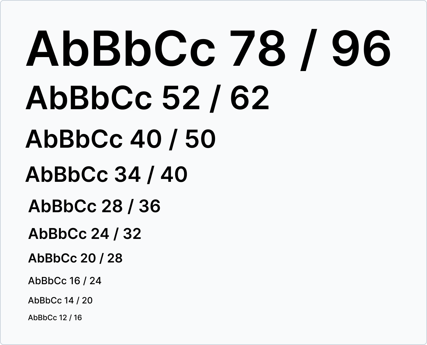
Font sizes
Fonts sizes have a ratio of a minor third (1.2), which means they scale up or down by that ratio then we rounded those numbers to multiples of 4px. Our line height follows the same principle but the used ratio is 1.5 to keep the vertical flow easy to process and harmonious.
| Token | Size / Line height (px) | Size / Line height (rem) |
|---|---|---|
| --r-font-size-7xl | 78 / 96 | 4.875 / 6 |
| --r-font-size-6xl | 52 / 62 | 3.25 / 3.875 |
| --r-font-size-5xl | 40 / 50 | 2.5 / 3.125 |
| --r-font-size-4xl | 34 / 46 | 2.125 / 2.875 |
| --r-font-size-3xl | 28 / 36 | 1.75 / 2.25 |
| --r-font-size-2xl | 24 / 32 | 1.5 / 2 |
| --r-font-size-xl | 20 / 28 | 1.25 / 1.75 |
| --r-font-size-l | 16 / 24 | 1 / 1.5 |
| --r-font-size-m | 14 / 20 | 0.875 / 1.25 |
| --r-font-size-s | 12 / 16 | 0.75 / 1 |
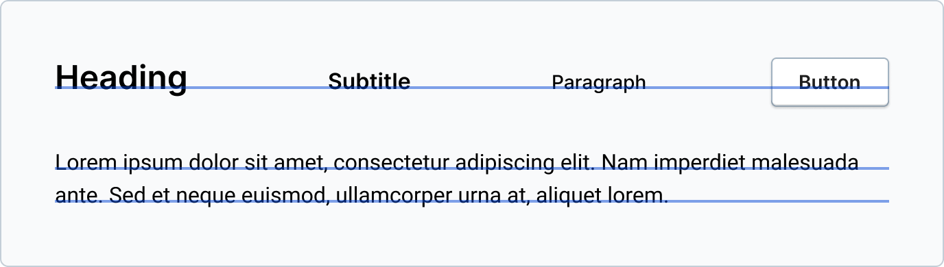
Baseline
Baseline is the imaginary line where the text "rests". Aligment with this line is crucial to keep harmony, specially when presenting elements with different height.
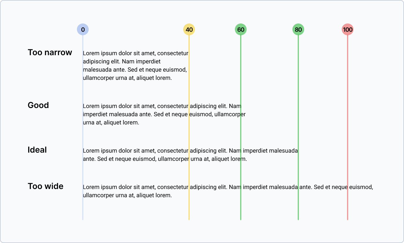
Line length
Having the right amount of characters on each line is key to achieve readibility of text. We should always try to aim for an average line of 50 to 90 characters including spaces.
Type styles
In order to offer a clear hierarchy between text elements Revel uses two styles body and headings.
Body styles
Referring to the text in the body of our interfaces, this style needs to always have good contrast.
Heading styles
The style that keeps various levels of information hierarchy by utilizing size and weight.