Space v1
Set of rules for how we measure, size, and space our UI elements.
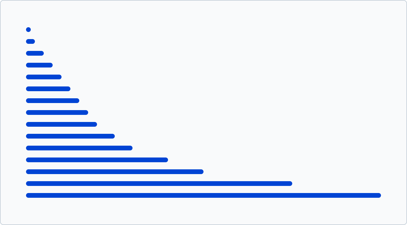
Space scale
UI elements and the space between them are designed according to a 4px rule (or pt/rem) for a consistent, standard sizing scale.
Revel units are designed to be dense at a small scale and become less dense as dimensions increase. This allows for a good range when working with them, but you must be deliberate when selecting which units to pair. We suggest that when designing with rhythm and contrast to create a clear visual hierarchy, you should skip at least one unit in the scale when combining different spaces.
Why 4px?
- Most popular screen sizes are divisible by four.
- Many platforms offer users the option to adjust their preferred 'density' by increasing or decreasing font size or whitespace between page elements. The 4px rule can be utilized to scale consistently while preserving the grid.
Space units
In order to ensure visual unity and equilibrium, all measurements employed (e.g. width, height, distance, etc.) should be based on the Revel unit of measurement.
| Token | Value |
|---|---|
| --r-space-0 | 0px / 0rem |
| --r-space-1 | 2px / 0.125rem |
| --r-space-2 | 4px / 0.25rem |
| --r-space-3 | 8px / 0.5rem |
| --r-space-4 | 12px / 0.75rem |
| --r-space-5 | 16px / 1rem |
| --r-space-6 | 20px / 1.25rem |
| --r-space-7 | 24px / 1.5rem |
| --r-space-8 | 28px / 1.75rem |
| --r-space-9 | 32px / 2rem |
| --r-space-10 | 40px / 2.5rem |
| --r-space-11 | 48px / 3rem |
| --r-space-12 | 64px / 4rem |
| --r-space-13 | 80px / 5rem |
| --r-space-14 | 120px / 7.5rem |
| --r-space-15 | 160px / 10rem |
If more space is neeed beyond the 160px / 10rem mark is possible to expand by multiples of 4
The 2px outlier
We added the 2px / 0.125rem unit to have more precision on smaller UIs.
Using space tokens
Space tokens define consistent spacing values throughout Revel, ensuring uniform margins, paddings, and gaps. They help maintain visual harmony and create a cohesive layout across all components.
They can be used in a CSS context or directly on the template by using the style helpers.
.page {
  padding: var(--r-space-6);
}
<section class="page r-inset-6">...</section>
In general space tokens or style helpers are used to "stack", "inset", or "inline" elements.
- Stack refers to adding a margin-bottom to an element.
- Inset refers to adding padding to an element.
- Inline refers to adding margin-right to an element.
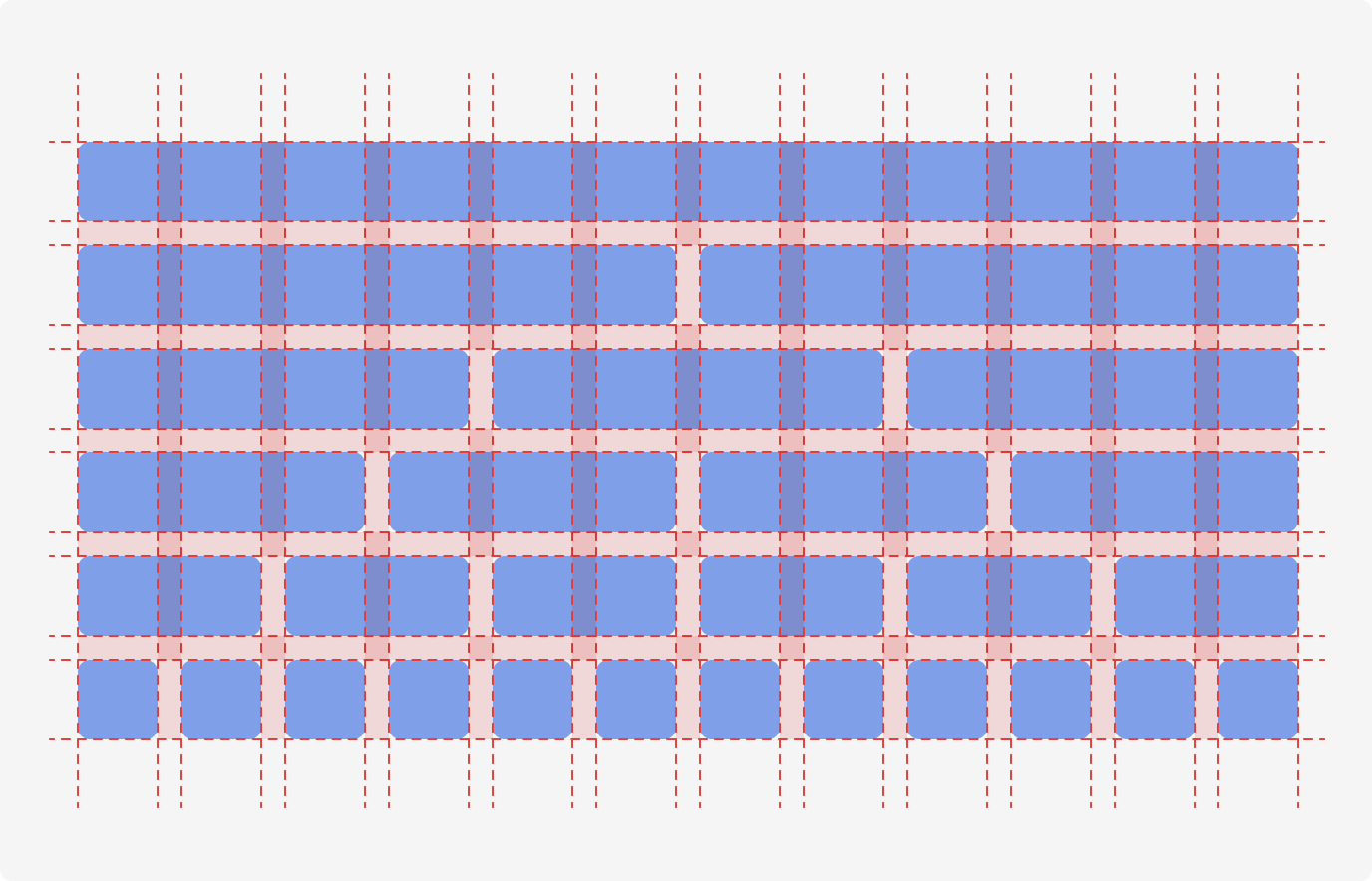
Grid
The 12-column grid system provides a flexible and consistent structure for layout design, ensuring responsive and balanced alignment across different screen sizes. It allows for easy content organization and adaptable layouts.
CSS Grid based system
The CSS Grid-based system offers a powerful and flexible layout structure, enabling precise control over content placement and alignment. It allows for seamless, responsive designs that adapt effortlessly to any screen size. See Grid component.
CSS Flexbox based system
The Flex-based system provides a simple and efficient way to create responsive layouts. It automatically adjusts elements' size and positioning, making it ideal for dynamic, flexible designs that adapt smoothly across devices. See Flex component.
Breakpoints
Setting breakpoints allows for the design to adapt to different screen sizes, providing a consistent and optimized experience for the user. Responsive design is key in creating this experience.
| Token | Range (px) | Usage |
|---|---|---|
| --r-breakpoints-xs | 0-576 | Phones |
| --r-breakpoints-s | 577-767 | Small tablets |
| --r-breakpoints-m | 768-1039 | Tablets |
| --r-breakpoints-l | 1040-1399 | Laptops |
| --r-breakpoints-xl | 1400+ | Desktops |