Icons v2
Simple, modern, and friendly visual helpers to guide our merchants to complete any task.
The work on Revel's icons is inspired by principles of balance, structure, modernity, approachability, crispness, intentionality, simplicity, and conciseness. They should have a sense of completeness and control, with border radius and open counters creating a combination of beauty and utility with a touch of personality. The elements of each icon should have a specific purpose and place, and be designed to minimize the time required for comprehension. The aim is for the icons to help users to understand the concept and take action, without getting hung up on superfluous visual elements.
Principles
Balanced
Icons should be designed to create a sense of balance and structure. They should be visually appealing and help guide the viewer's eye. Symmetry is not necessary, but the icon should bring a feeling of completeness and control.
Simple but effective
Design to reduce the amount of time needed to understand. Just as "invisible UI" helps users to complete tasks without being distracted by visuals or controls, icons should help users to grasp concepts and take action quickly, without spending extra time deciphering metaphors.
Crisp and modern
Pixel hinting as much as possible to create icons that feel crisp and with intention. Our icons are modern and approachable, with a touch of personality. They present a set of features that provides both beauty and practicality.
When to use them
- Primary navigation
- Banners
- Inline with text
- Empty states
- Calls to action
- Direct the merchant's attention
Icon grid
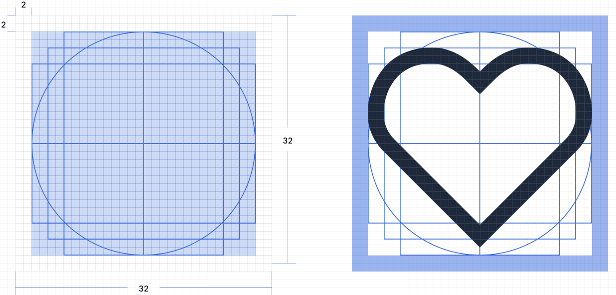
Every icon is designed on a 32px × 32px master canvas. The canvas is an invisible container that keeps every icon at the same visual weight, so icons align consistently regardless of their shape.
The canvas includes 2px of padding on all sides, leaving a 28px × 28px content area for the artwork. This spacing prevents icons from appearing crowded next to text or other icons and ensures that strokes do not touch the canvas edge.
Within the content area, a defined set of keyline shapes is used to maintain consistent proportions across icons. The shapes include square, circle, vertical rectangle, and horizontal rectangle. Icons with a circular form use the circle keyline. Taller icons, such as documents, use the vertical rectangle keyline. This ensures visual consistency across the icon set.
All paths are pixel-hinted to the 32px grid. Vertices, strokes, and intersections align to whole pixels to ensure consistent rendering at 32px and when scaled.
The default size is 20px. The 24px and 16px sizes are produced by scaling the 32px master proportionally. The 2px padding and 28px content area scale proportionally: 21px at 24px, 17.5px at 20px, and 14px at 16px. All paths align to the 32px grid. Shape and stroke weight remain consistent across all sizes.
Border and border radius
The 32px master uses two consistent values: a 2px stroke for outlines and a 2px border radius for corners that are not curved. Strokes use rounded line caps and rounded line joins by default. Square caps are used when required to preserve the icon shape or indicate clipping or depth.
Both values scale proportionally with the canvas. The same scaling is applied to the content area. This ensures consistent shape and stroke weight at sizes from 32px to 16px.
| Canvas | Stroke | Border radius |
|---|---|---|
32px | 2px | 2px |
24px | 1.5px | 1.5px |
20px | 1.25px | 1.25px |
16px | 1px | 1px |
Design the stroke and corner on the 32px grid. Smaller sizes use the same values through proportional scaling. This keeps stroke width and corner radius consistent across sizes.
Create a new icon
- Draw on a
32px × 32pxcanvas with2pxpadding, resulting in a28px x 28pxcontext area) - Use a
2pxstroke with rounded line caps and a2pxborder radius. - Pixel-hint to whole pixels.
- Flatten to a single vector and scale down to
24px,20px,16px. - Use
kebab-casefor the file name.
Spot icons
Spot icons are visual elements used to emphasize and reinforce messaging in product experiences that are viewed multiple times. These icons help to draw attention to the message and ensure that it is understood. The default size for spot icons is 80px.
- Used on empty states
- Used for displaying any important status on merchant's or customer's flow
