Colors v2
Communicate the meaning and tone of our experiences by using our brand colors.
Revel's design system uses rules to incorporate colors at both the theme and component level. These regulations help set a visual tone, show interaction, and communicate meaning while keeping your brand identity intact.
Principles
Intentional
Employ color carefully and strategically to convey important information and focus the eye. By using color judiciously, we create a system that can be used for long periods of time without causing visual exhaustion.
Color roles
Revel palette of colors is carefully chosen to serve particular purposes. For instance, colors are assigned to components like text, status, buttons and navigation, so that people can easily recognize each one and understand their relationship to their surroundings.
Derivative
Derivative colors maintain visual cohesion, offering flexibility for different UI components. These nuanced shifts enhance aesthetics and usability while ensuring overall consistency in the design.
Accesible
The application of the color system will ensure it is in line with color accessibility regulations. We are compliant with WCAG 2.1 level AA, which specifies a contrast ratio of 4.5:1 for text.
Color system
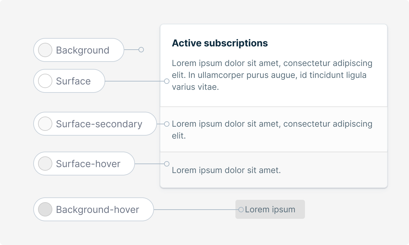
Surface
Surfaces are the primary UI elements employed in applications. They are applied to pages, modals, tables, headers, and cards and are situated above the background.

Text
Add colors to elements that show up on plain surfaces, such as borders, secondary symbols, and written components.

Primary
Employ primary colors for interactive elements such as buttons, icons, and text on navigation and tabs, as well as for the background of navigation and tab interactive states.

Complementary
Use on interactive elements, icons, and text to highlight a specific state.

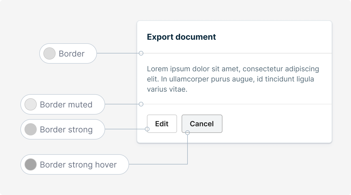
Borders
Borders can outline the boundary of a component or differentiate between different content areas.

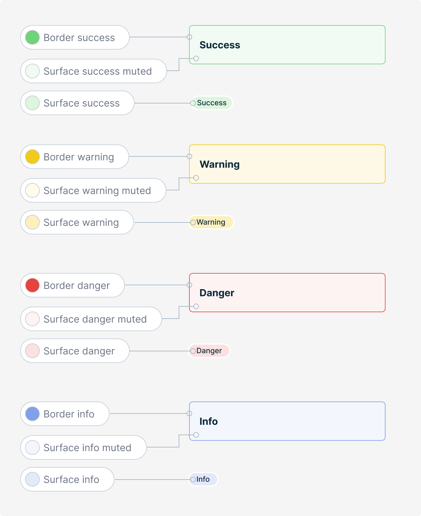
Status
By utilizing color, we can bring attention to important information and give it a sense of importance. For instance, a green hue can be used to indicate a strong positive state, such as success.

Icons
When an icon is placed on a surface, it should be in an appropriate color. If the icon appears on a primary color, the text-on-surface color should be used instead of the default icon color.
![]()